Halloween 2015 Trick or Treaters Part 3: Visualizing the Results
Halloween 2015 Trick or Treaters Part 1 and Part 2
I love plotting data so the most exciting part of most projects, tracking my trick or treaters included, is getting the data and trying to figure out fun plots I can make out of it. Unfortunately, we didn’t have very many trick or treaters this year so I was limited with what I could plot. Nevertheless, I used it as an opportunity to research different plotting tools for MySQL data. In making this tutorial, I wanted to open up my Halloween database. When I typed [text] mysql -u root -p [/text] into the command prompt, I received an error:
Can't connect to MySQL server on 'localhost' (10061)
This is because the MySQL server isn’t running. There are a couple of ways to fix this. First, you can find and run the mysql.exe file which should be located under C:\Program Files\MySQL\MySQL Server 5.7\bin. I thought that there must be some open source options for plotting data that is held in a MySQL database. I found only a couple of options and neither seemed very good. I decided to go with DBPlot. To install DBPlot, click the download button on the link above and follow the directions. Once it is running, we need to add a data source (a link to our database). Click Add Data Source in the upper left. 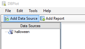 Next, choose MySQL in the dropdown for DB System. The connection name can be anything, but I suggest naming it the same as your database. If the database is on your local machine as it was in my Building Your First Database post, put ‘localhost’ in for the server address. Next, we need to know what port our database is on. To figure this out, run MySQL Installer and click ‘reconfigure’. You should see your port number listed on the Type and Networking page (this is also where you would go if you wanted to change it). Finally, fill in your User ID and Password.
 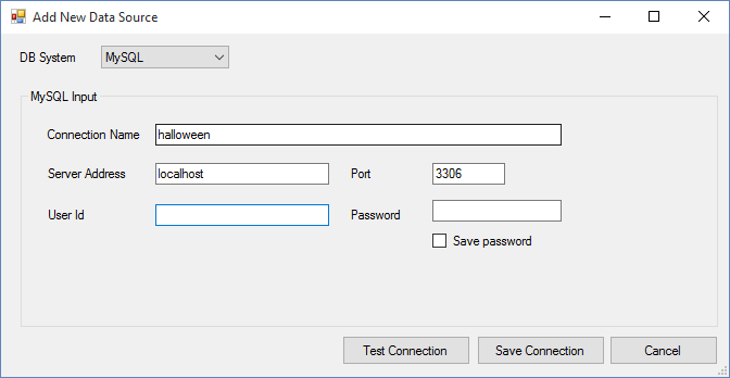 Once everything is filled in, click Test Connection to make sure everything is working. Once it is, click Save Connection. You should now see your data source listed on the left under Data Sources. If you double click it, a box pops up that allows you to open the connection. Go ahead and click ‘Open Connection’. This actually connects to all of the databases on your server. So for me, I see my halloween, pantry, and sys databases. I’m only currently interested in the halloween database, so I named the connection halloween.
 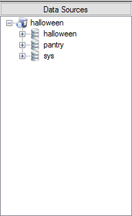 Right click on the database you are interested in and choose ‘New Query’. This will allow you to do any MySQL query and get the result in the lower portion of the window. This can be more helpful than using the command prompt because you can interact with the data a little easier. For instance, if I use the SQL command [sql] SELECT group_id, no_kids FROM halloween.group; [/sql] I will get a table in the lower portion of the screen. With this table, I’m able to click on the column names to order, I can easily copy and paste into Excel or another spreadsheet program, and I can even export to a CSV. It is pretty handy for large selections of data if you want to quickly rearrange columns or get them into Excel. (Note: I named one of my tables ‘group’. This was a beginner’s mistake because ‘group’ is a reserved SQL command. While it allows you to create a table with that name, since it is a reserved word I have to tell MySQL that when I say ‘group’ I mean a table. Because of this, when I reference that table I must use databasename.tablename. This is why I must type halloween.group in the above command instead of simply FROM group.)
 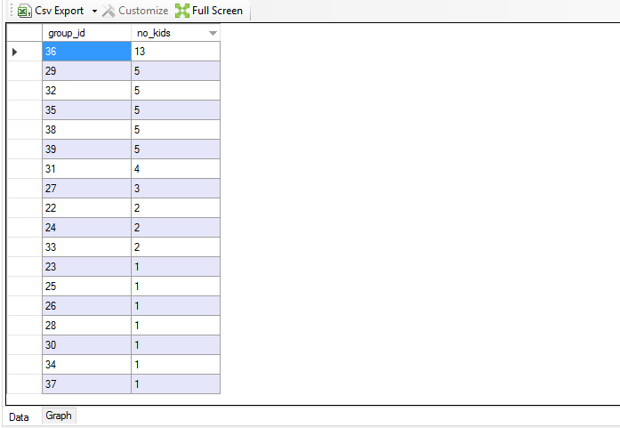 Creating a plot from this data selection is pretty easy. In the bottom left (right underneath the 37 in the image above), click on ‘Graph’. There will not be anything initially because the program needs to know what you want the axes to be. In the upper left, click the dropdown for [X Axis] and choose the column you want to be the x axis. Do the same for the y axis.
 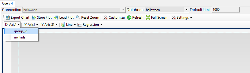 You can then choose the chart type by clicking the forth dropdown in that list (‘Line’ is selected for the image below).
 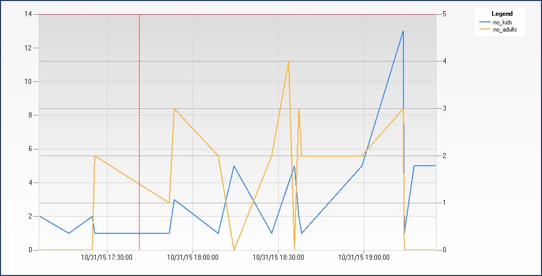 The query for this plot is [sql]SELECT gtime, no_kids, no_adults FROM halloween.group;[/sql] This is a fairly easy plot to make because all of the data is from the same table. Since we try to normalize our tables, we often want to look at related data that could be in many different tables. An example could be to see how many of each type of candy was taken at my house on Halloween. The table ‘kid’ has a column for which candy each kid took, referenced by the candy id (the primary key for the candy table). To get the candy name, I need to look at each candy id and match it with the candy name from the ‘candy’ table. To do this, the query would be: [sql]SELECT candy.candy_name, COUNT(kid.candy_id) FROM candy LEFT JOIN kid ON candy.candy_id = kid.candy_id GROUP BY candy.candy_name;[/sql] JOIN deserves it own post but for now understand that this is selecting the candy names from the candy table and putting each name into the same row as that candy’s sum from the kid table. The resulting table would look like:
candy_name
COUNT(kid.candy_id)
funsize
0
skittles
10
snickers
32
sour_skittles
2
starburst_orig
8
starburst_tropical
1
toblerone
2
wildberry_skittles
3
If we type this into the query section of DBPlot, we can make a bar chart like this:  DBPlot seems pretty powerful if you understand the basics of SQL queries. However, it doesn’t seem like it has many options for the look and feel of the plots. It may be better for reporting to use the query portion of DBPlot to get the data into a table and either copy or export it to Excel, where you would have much more flexibility on the types and looks of your plots.