Visualizing SQLite Data using Qlik Sense Desktop
Qlik Sense Desktop is a free (for personal use) software that is used to visualize data. I was really impressed with Qlik Sense right away – it has the feel of an expensive enterprise level software. I have repeatedly thought to myself _I can’t believe this is free _(though, really, how many people out there want to visualize their personal data? ). Perhaps the most impressive thing about Qlik Sense that I have found so far is how interactive it is. I’ll describe this more later in the tutorial. In this tutorial, I will assume you have already created a SQLite database, connected it to Qlik Sense Desktop, and created a new app within Qlike Sense. If you haven’t yet, check out my tutorials on creating a SQLite database and connecting a SQLite database to Qlik Sense.
Step 1: Create a New Sheet
Qlik Sense has two basic ways to present data: sheets and stories. A sheet is one page of graphs and stories are like PowerPoint presentations. In order to create a new sheet, click on your app from the Qlik Sense Desktop Hub. For me, this is ‘BoardGamePlays’:  Next, click the Create New Sheet button towards the middle of the page:
 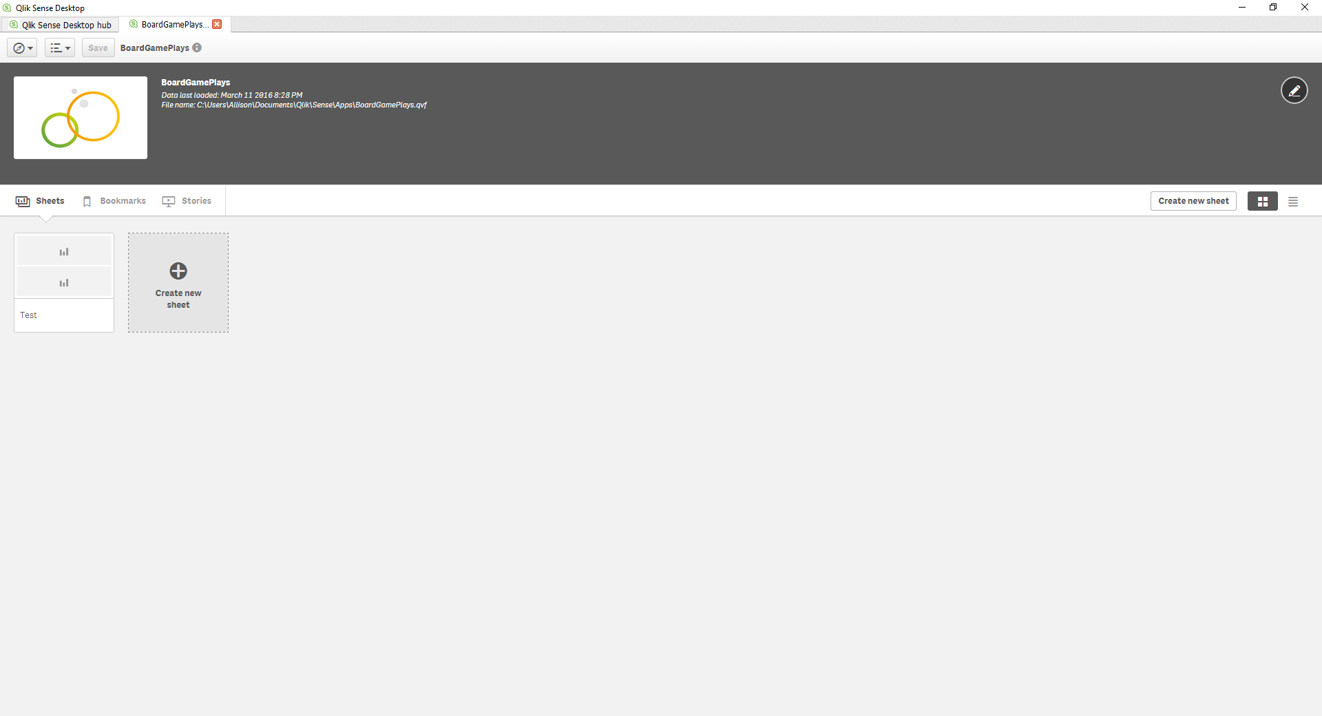 Give the sheet a meaningful name. I’ll call mine ‘Play Data’ because I will be generating graphs based on play data. If you will be making several sheets, it would be a good idea to put a description of how you intend to use the sheet in the Description box. Next, click the sheet (it will still have the name ‘My new sheet’, this is okay).
Step 2: Add Charts to Sheet
When you first open your sheet, it will be empty. The window tells you what to do – click the pencil button on the top right (Edit) to edit your sheet and add charts: 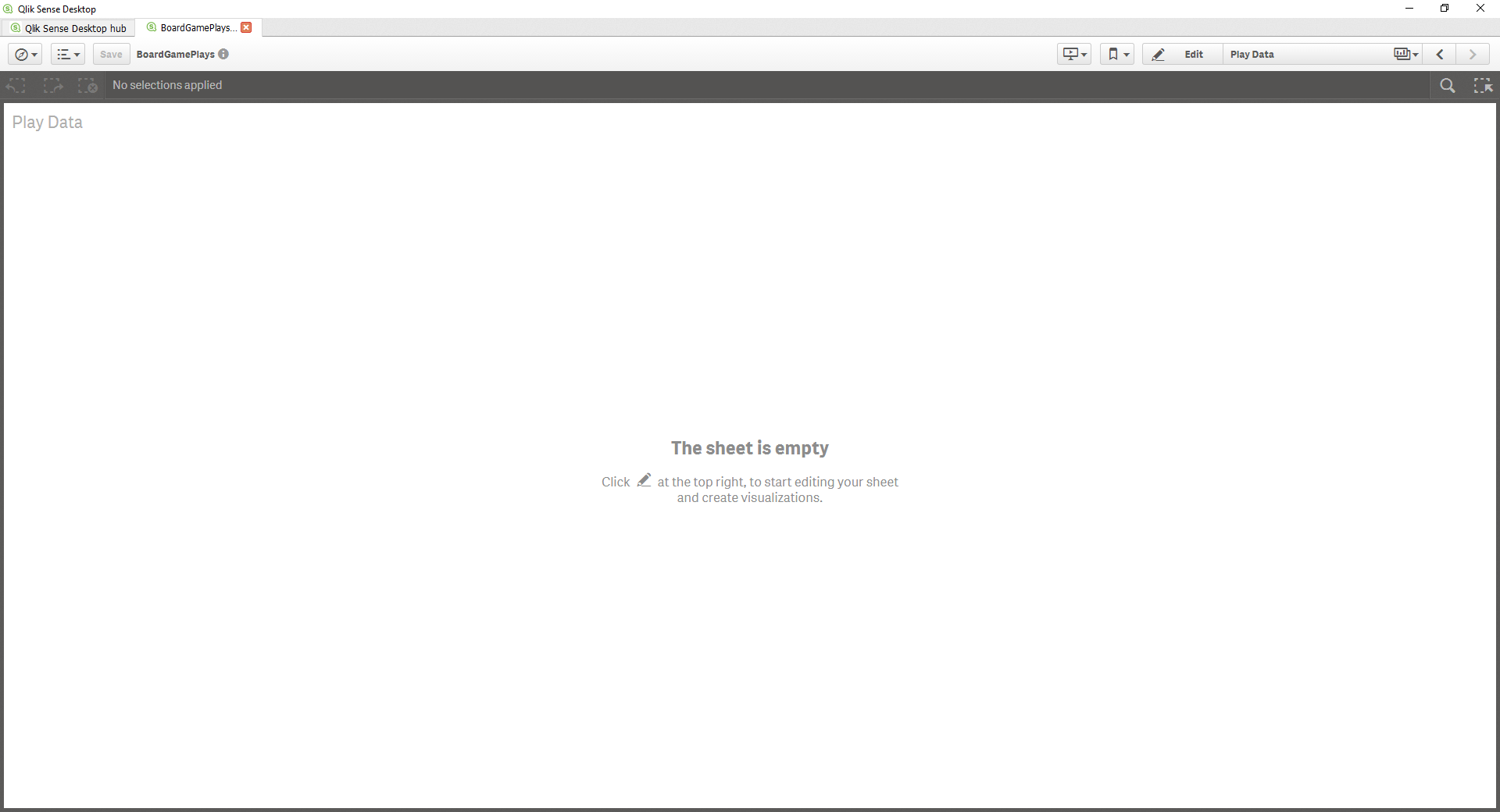 After you do this, you will be presented with a new window that has chart types on the left side and your sheet (with a grid) on the right side:
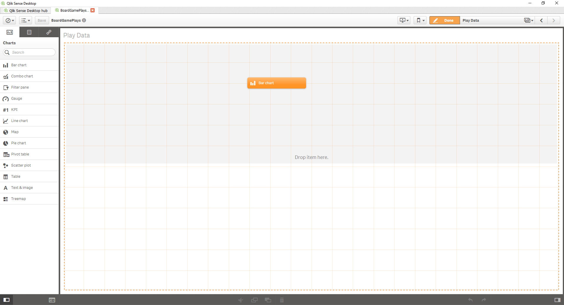
 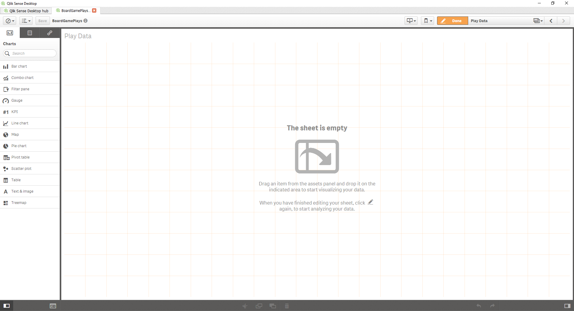 One of the really cool things about Qlik Sense is that is how easy it is to choose and organize your sheets. Simply choose the plot type you want from the left and click and drag it to your sheet on the right. When you do this, if you drag your mouse around you will notice different portions of the sheet will become highlighted. This is because you can dock your chart either on one of the sides left or right or on the top or bottom. This will make more sense after we add our next chart. Here are the two options for your first chart:
  )
) I chose the second option, so my chart will come in on the top half:
 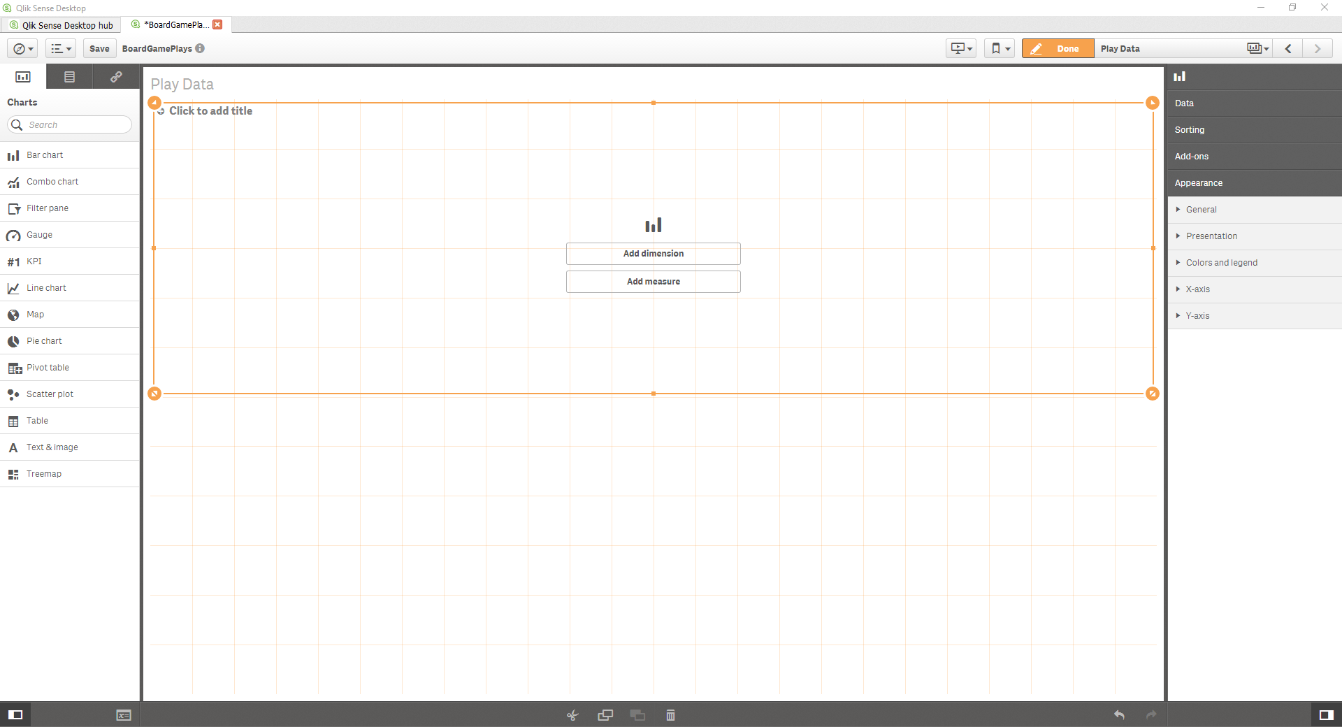 I want to make two bar charts, so I added a second bar chart below the first one. Before we go any further, we can go ahead and save this sheet. On the upper left next to your app name, click Save. I haven’t had any issues with Qlik Sense crashing but it is better safe than sorry!
Step 3: Use SQL Select Command to Choose Data
Now, we need to get some interesting data to plot! I could plot data from different columns from my tables in my database but that isn’t very interesting. The two bar charts I want to plot are the average duration of plays per game name and the total number of times each individual game has been played. Click the compass button on the upper left and choose ‘Data load editor’ to open the script tool within Qlik Sense. 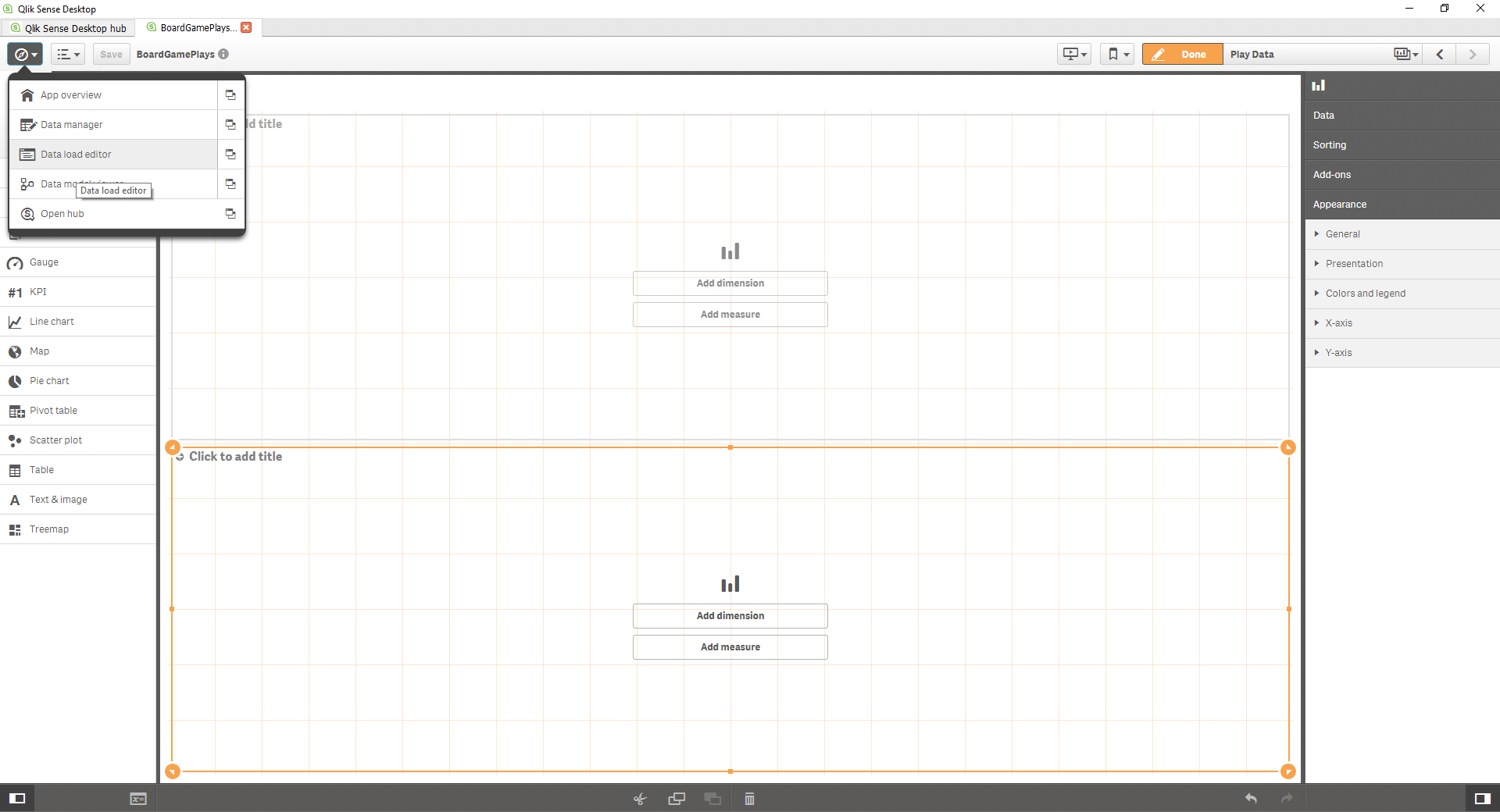 When you open the script editor, it should look like this. If you followed my previous tutorial, you should already be connected to the database by using the command: [text] LIB CONNECT TO ‘yourdatabase’; [/text]
 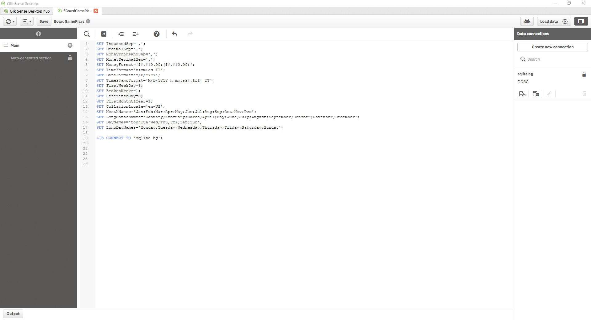 I need to generate two SQL commands to select the data that I want. I like to open the database and test my SQL statement first to make sure I am getting the data I want. The first SQL statement is: [SQL] SELECT games.name, plays.duration FROM games, plays WHERE games.game_id = plays.play_id; [/SQL] This selects the duration of every play as well as the game name played. I don’t want to group these together within the select statement (we will do that within Qlik later). All I want is the raw data. Next, I want to select the number of times each game is played. The trick here is that we need to group the data by the game: [sql] SELECT games.name, plays.game_id, count(plays.game_id) AS playcount FROM plays JOIN games ON games.game_id = plays.game_id GROUP BY plays.game_id; [/sql] Both of these select the data within SQLite so I am comfortable adding them to the script editor within Qlik Sense. The only additional thing we need is to tell QLik Sense that we are doing SQL selects. Therefore, before the SELECT statement, we should add SQL. The first statement would then be: [sql] SQL SELECT games.name, plays.duration FROM games, plays WHERE games.game_id = plays.game_id; [/sql] Once you have your own SQL statements in the editor, click the Load Data button on the upper right (it also has the ‘play’ icon). If everything went correctly, you should get a window that says:
Data load progress Data load is complete. Statement information App Saved Finished successfully
Step 4: Link Data to Charts
Open your sheet back up and click Edit. You will notice two buttons inside each chart: Add dimension and Add measure. Dimensions are the X-Axis and measures are the Y-Axis. I want my top chart to be the average duration for each play – therefore, my X-Axis (dimension) should be game name. Click Add dimension and choose your dimension (for me, it is ‘name’)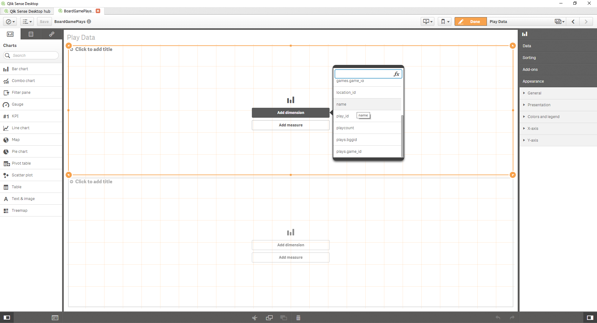 My measure will be the average duration. I click ‘Add Measure’ then ‘duration’. A new window is displayed with Sum, Count, Avg, Min, and Max. I’ll choose Avg to get the average duration:
 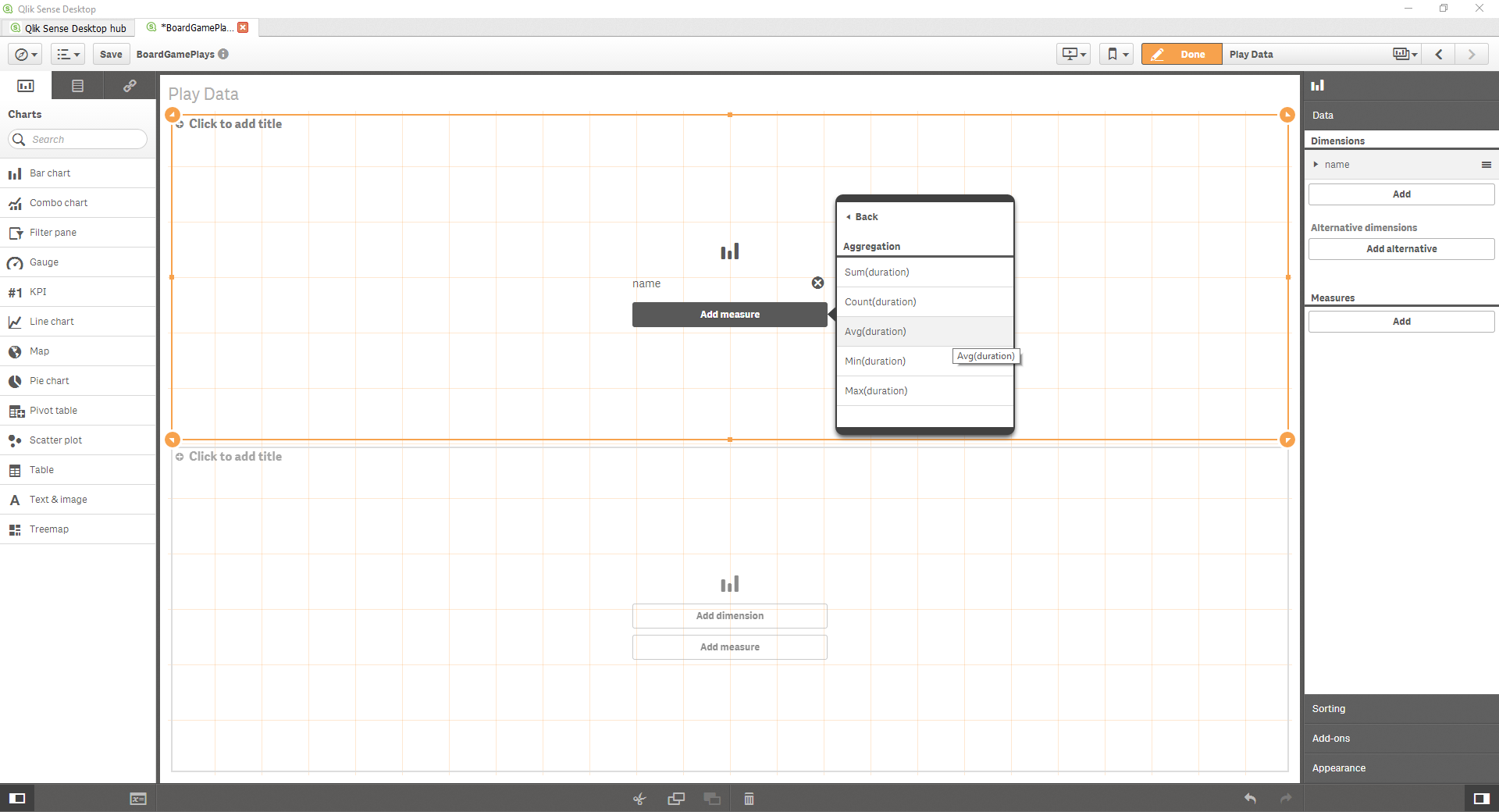 The chart will be added but it isn’t interactive until we click the orange ‘Done’ button in the upper right.
 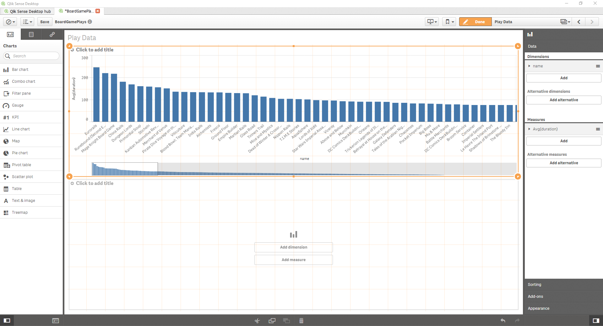 I do a similar thing for the plot on the bottom. My dimension will be the sum of the playcount. My sheet now looks like this from the edit menu:
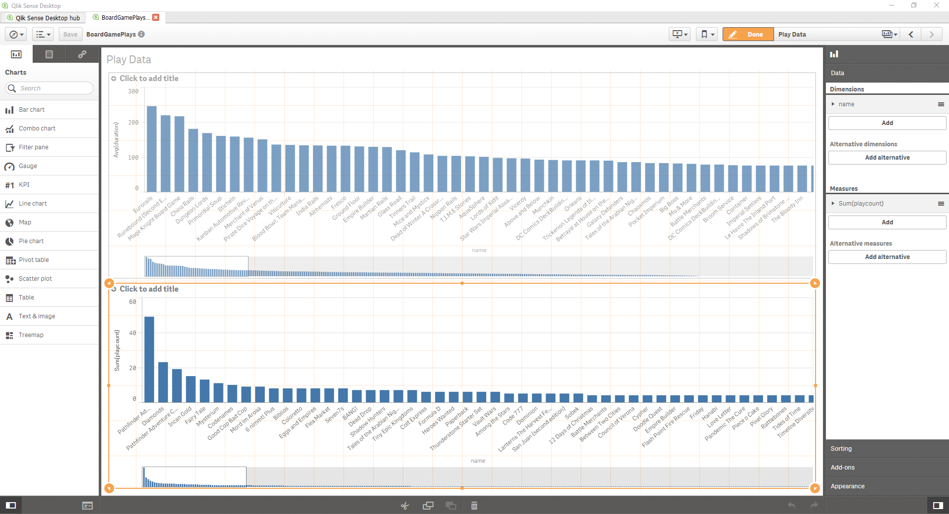
Step 5: Appearance
If you click on a plot, you can change its sorting and appearance by choosing the appropriate option from the menus on the right. I’ll change the bottom plot to be horizontal and I’ll add some chart names. The end result looks like this: 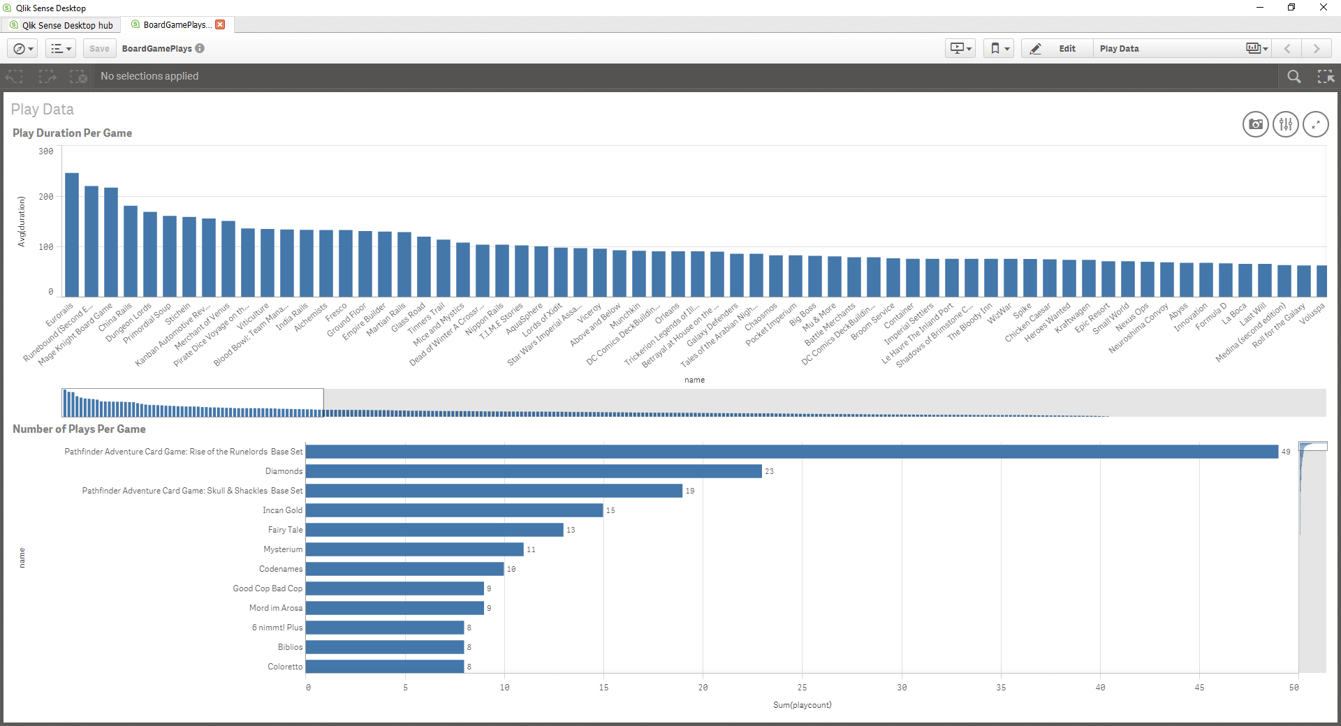
Step 6: Interacting With Charts
One of my favorite features of Qlik is how easy and efficiently you can interact with your data. For instance, if I only want to look at a few specific games I can click on either chart the games I want. All of the lines except the chosen ones will be grayed out in the plot that you are selecting the data from and they will be completely removed from the view of the other plot. Below is an example: 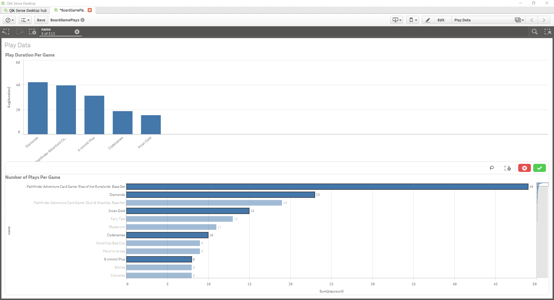
Conclusion
I know I have only scratched the surface of this software. I can tell I will really enjoy working with it and it has moved near the top of my list of things I want to learn more about. My only disappointment right now with Qlik is its (seemingly) inability to export the data in an interactive form. I am really impressed with Qlik Sense and I’m excited to see what Qlik View has to offer. Have questions or suggestions? Please feel free to comment below or contact me.