Visualize NFL Data with R
Every year, I love football season a little bit more. This year is it is particularly true - I am a first year season ticket holder for my beloved Colts and I’m also really getting into data, databases, and statistics (which the NFL is full of!). I thought a good way to get more into R would be to use it to visualize some NFL data. I’m not the first to do this but it seemed like a cool project nevertheless. First, we need some NFL data. We could certainly pull in data on our own from a number of different tools (including the NFL Python module I discussed here). However, I want to get right into using R so I went ahead and just downloaded the free sample data available here. Next, we need to pull this data into R. Within RStudio, type the command:
nfldata <- read.csv(file.choose(), header = TRUE)
The file.choose() portion of this line opens up a window for you to navigate to the csv file where your data is living. The read.csv() function reads it in and the arrow loads it into the variable nfldata. Next, we want to attach this ‘database’:
attach(nfldata)
The attach() function accepts a data.frame, list, or R file and allows you to use objects within the database by name. We’ll see more on this later. To view the first few rows of data, you can use the head command:
head(nfldata)
Here, we can see that our columns include gid, pid, off, def, type, dseq, len, qtr, and so on. Gid is the unique identifier for the game, pid is the unique identifier for the play, off is the 3 letter name of the team on offense, def is the 3 letter name of the team on defense, and so on. Lets look at how teams played on offense depending on where they were on the field (their yardline) and the down they were on. The fields in our dataframe that we will care about here are yfog _(yards from own goal), _type (rush or pass), dwn (current down number: 1,2,3, or 4). We will want a table with each of these columns as well as a sum column. That way, we can see how many times a pass attempt was done on the 4th down when a team was X yards from their own goal. To do this, we will use a package called plyr. The Internet says that this package makes it easy for us to split data, mess with it, and then put it back together. I am not convinced the tool is easy, but I haven’t spent too much time with it. Within the plyr library is a function called ddply. This function will take a data frame (the d in the function name), mess with the data to get it into an output form you want, then output back as a dataframe. It has a brother function called ldply, which does the same thing but with lists. Before we actually use this function, lets look at a simple example. Say you have the following data:
# year count
# 1 2000 5
# 2 2000 7
# 3 2000 11
# 4 2001 18
# 5 2001 4
# 6 2001 18
# 7 2002 19
# 8 2002 13
# 9 2002 13
Say we want a dataframe where the columns are year and the sum of the count per year. To do this, we would use the lines:
library(plyr)
ddply(d, “year”, function(x){
sc <- sum(x$count)
data.frame(sum.count = sc)
})
The output here would be:
year sum.count
1 2000 23
2 2001 40
3 2002 45
The ddply function takes in a dataframe (in the above example, d), the columns you want to manipulate, and finally the function you want to use to manipulate the data. For us, we’ll use the line:
playcomp <- ddply(nfl_off, .(yfog,type,dwn),summarise, playsran = length(pid))
If we run the head command, we’ll see the top few lines of the output are what we expect:
yfog type dwn playsran
1 1 PASS 1 2
2 1 RUSH 1 1
3 2 PASS 1 1
4 2 PASS 2 1
5 2 RUSH 1 3
6 2 RUSH 2 2
Next, we will need to install a plotting package. Run the following line in the console:
install.packages(‘ggplot2’)
This may take several minutes to install. Once it does, we can load the library into our script with the library command:
library(ggplot2)
The qplot function within the ggplot2 library will make a scatter plot. Within this function, we’ll need to define our x and y values, labels, and limits. Just like most other programming languages that allow you plot, there are a lot of attributes you can add or take away from this function. However, one way to do a plot would be:
qplot(x=playcomp$yfog, xlab=”Yardline”, ylim=c(0,100), y=playcomp$playsran, ylab=”Number of Plays”,
color=as.factor(playcomp$dwn),
shape = playcomp$type)
The result of that plot is not very helpful: 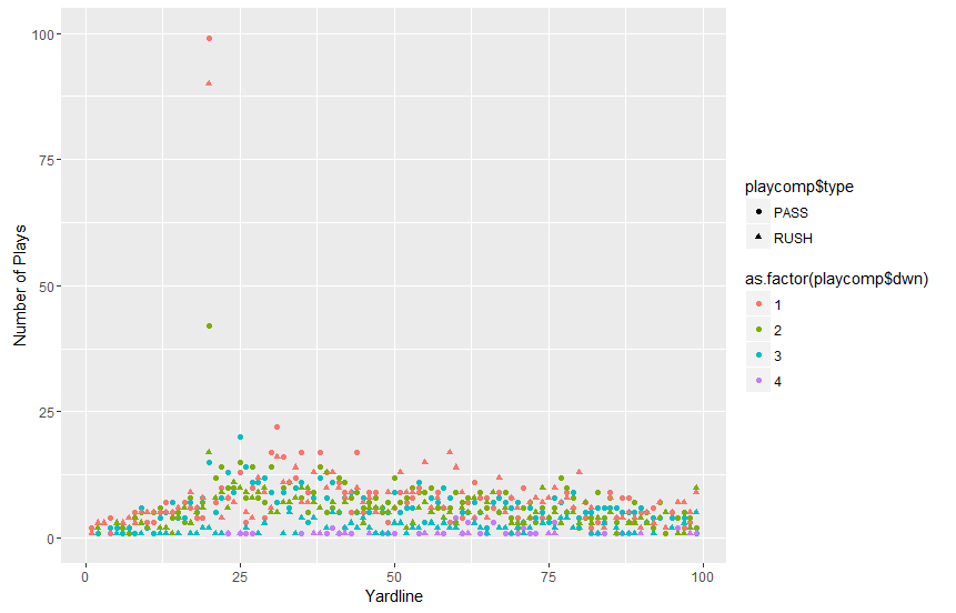 The x data is the yfog column from the playcomp dataframe. We declare that as
x = playcomp$yfog
The y data is defined in the same manner (it is the playsran column of the same dataframe):
y = playcomp$playsran
The colors are defined by the current down:
color = as.factor(playcomp$dwn)
Finally, the shapes are unique depending on the play type (pass/rush):
shape = playcomp$type
This is neat, but we can’t really draw many conclusions (except maybe teams often have a first down around the 15 yard line?). It would be far better to break this data up by down. Also, almost all of the data is below 50 plays. We might consider limiting our results only to those that have a number of plays less than 50. To do this, lets create a very similar plot and assign it to the variable plot_one:
plot_one <- qplot(data=playcomp, x=yfog, xlab=”Yardline”, y=playsran, ylim=c(0,50),
ylab=”Number of Plays”, color=as.factor(type))
Besides declaring this plot to a variable, we also are limiting the y axis to only go up to 50 (ylim = c(0,50)) _and we are no longer adding distinct shape based on down. Also notice I declared the dataframe in the _data variable. This allows us to only need to call the column we want (for instance, x = yfog) instead of declaring the dataframe$column name (x = playcomp$yfog). This new plot will not be displayed in the output because it was declare to a variable. Next, we need to add this plot variable to a facet. A facet is a way to divide up our plots into multiple plots. The general syntax for this is normal_gg_plot + facet_wrap(~ attribute_to_divide_up_plots_by). For us, we’ll use the command:
plot_one + facet_wrap(~dwn) + scale_color_discrete(name=”Play Type”, labels=c(“Pass”,”Rush”))
Here, we are adding our normal plot, plot_one, with the added facet_wrap function. The final object that is added here is our legend. The output of this plot is much easier to understand: 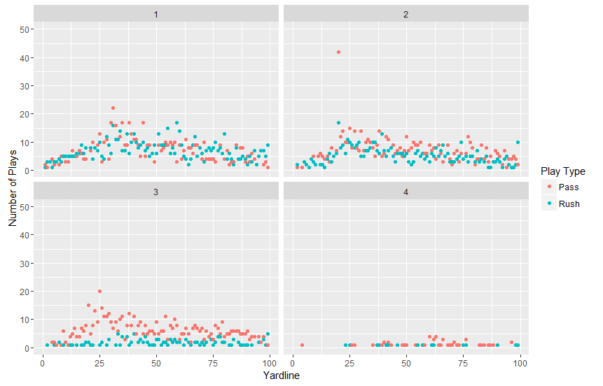 I still have a LOT to learn about R. It is a really interesting language and I’m excited to get deeper into it. I’m hoping I can start visualizing some of the Colts games within R, so stayed tuned for that! Have questions or suggestions? Please feel free to comment below or contact me.